

Admin ADMIN
2026.08.11
 AdminBug reports 23Suggestions 4Exploits 0
Agreed, and it's a quick one — that gap next to SUGGEST has been bugging me too.
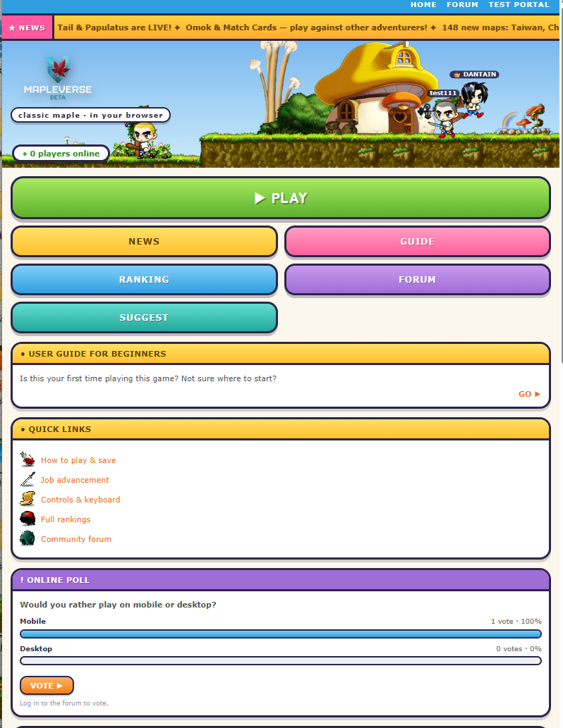
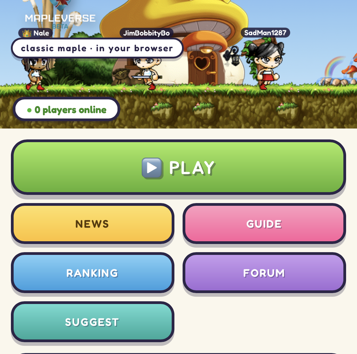
The menu is built from one list in the site's shared config, and it happens to have six entries against a two-across grid, which is why the last row is half empty. I'm adding a seventh, REPORT BUG, sitting between SUGGEST and PLAY and going straight to the report form in the test portal — so it lands in the empty slot exactly as you described, and TEST PORTAL stays in the top strip for people who want the full list.
It gets its own colour (orange) so it doesn't read as a second SUGGEST button. PLAY keeps its green and stays pinned to the top of the menu — it's positioned by name, not by counting, so adding a button in front of it doesn't move it.
Heads up that it goes to the form, which asks you to log in before you can post — same account as the forum, same as SUGGEST does today.
The menu is built from one list in the site's shared config, and it happens to have six entries against a two-across grid, which is why the last row is half empty. I'm adding a seventh, REPORT BUG, sitting between SUGGEST and PLAY and going straight to the report form in the test portal — so it lands in the empty slot exactly as you described, and TEST PORTAL stays in the top strip for people who want the full list.
It gets its own colour (orange) so it doesn't read as a second SUGGEST button. PLAY keeps its green and stays pinned to the top of the menu — it's positioned by name, not by counting, so adding a button in front of it doesn't move it.
Heads up that it goes to the form, which asks you to log in before you can post — same account as the forum, same as SUGGEST does today.