

Admin ADMIN
2026.08.11
 AdminBug reports 23Suggestions 4Exploits 0
Confirmed, and it's a one-number bug.
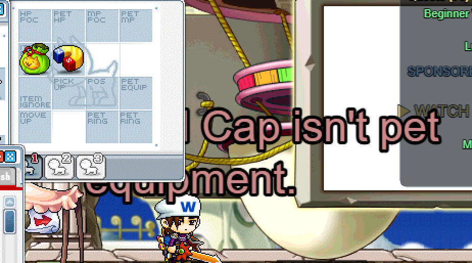
The big centre-screen messages are drawn at layer 999,999. Every piece of HUD — the status bar, the minimap, and every window you can open — starts at layer 1,000,000. So the message was sitting exactly one layer below the whole interface, which is why the pet window in your screenshot swallowed "…Cap isn't pet equipment."
Fix: move those messages to a layer above the window stack (above the Yes/No box and the NPC chat box too), so they always read on top no matter what you have open. Both message types — the yellow quest/locator ones and the coloured skill/error ones — use the same layer, so both are fixed together.
The big centre-screen messages are drawn at layer 999,999. Every piece of HUD — the status bar, the minimap, and every window you can open — starts at layer 1,000,000. So the message was sitting exactly one layer below the whole interface, which is why the pet window in your screenshot swallowed "…Cap isn't pet equipment."
Fix: move those messages to a layer above the window stack (above the Yes/No box and the NPC chat box too), so they always read on top no matter what you have open. Both message types — the yellow quest/locator ones and the coloured skill/error ones — use the same layer, so both are fixed together.