HOMEFORUMSUPPORTDISCORD
★ TEST
✦ Welcome to the MapleVerse Test Portal! ✦  Found a bug? Report it here — paste a screenshot right from your clipboard! ✦  9 issues being tracked — thank you, testers! ✦✦ Welcome to the MapleVerse Test Portal! ✦  Found a bug? Report it here — paste a screenshot right from your clipboard! ✦  9 issues being tracked — thank you, testers! ✦
#153 Dialog box is wrong FIXED
CRITICAL UI & Windows 🍄reported by Mark · 2026.08.08 · updated 2026.08.12
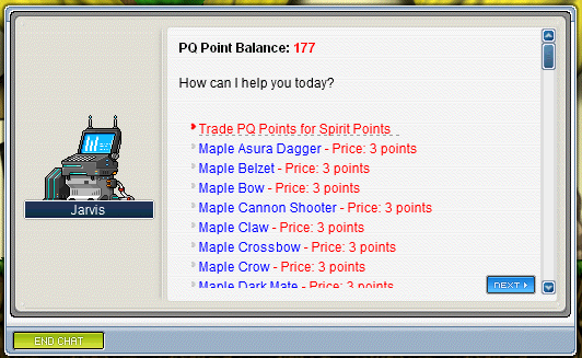
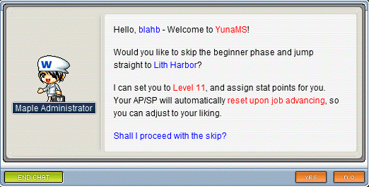
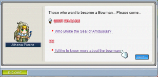
our dialog boxes are laid out wrong, here are 3 examples of how it should look, study them and compare
screenshot 1screenshot 2screenshot 3
🍅 ME TOO · 0 Sign in to confirm this bug.
COMMENTS 4 replies
Mark ADMIN 2026.08.08
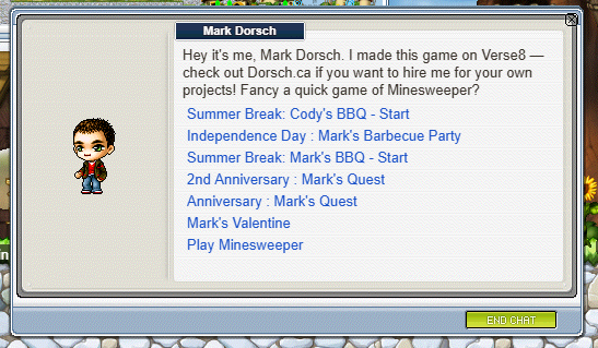
for example, here is how ours looks.

The nametag is in the wrong location, it should be under the NPC sprite.
End Chat should always be visible, and should be on the bottom left.
there shouldnt be an X button on the top right
There is no Quest available or Etc headers for the options.
Yes/No and Next are not in the correct spots

screenshot 1
Admin ADMIN 2026.08.11
Confirmed — thanks for the three reference shots, they made this easy to check. I went through your list against the original client's own dialog code and four of the five are straight bugs on our side:

1. Name plate — you're right. The original draws it in the left well, under the character portrait, halfway down the box. We draw it at the top of the white text area on the right. Fixing.

2. End Chat — the original pins it 9 pixels in from the left edge of the bottom bar, and it is always switched on for every kind of dialog. We place it floating just to the left of whatever other button is showing, which drifts around the box as the buttons change. Fixing.

3. The X in the corner — correct, that shouldn't be there. The original dialog box has no corner close button at all; End Chat is the only way out. Removing it.

4. Yes/No and Next positions — also correct. The original puts OK at a fixed spot near the right edge, and Yes/No as a fixed pair with a set gap between them, all on the same line as End Chat. Ours right-aligns them against the text panel instead, so they land in slightly different places depending on the page. Fixing to the real coordinates.

5. The "Quest available" / "Etc" headings above the choices — this one isn't a layout bug, it's that we never build the grouped menu at all: we jump straight into the quest conversation instead of showing the NPC's list of options under those headings. That's a bigger piece of work than the other four, so I've noted it as its own job rather than lumping it in here.
Admin ADMIN 2026.08.11
You're right that the speaker's nameplate was in the wrong place. It was being drawn as a title bar across the top of the white text panel; in the real client it sits in the tan portrait well, directly under the NPC, with the NPC standing on top of it. I've moved it there and re-seated the portrait so its feet rest on the plate, which is exactly how the reference client positions both (nameplate at 22px from the left, halfway down the box; portrait centred over it).

The other four points in your comment are real too, but they're separate edits in different parts of the file and I'd rather not bundle them into one change: End Chat moving to the bottom-left, dropping the ✕ in the top-right corner (the reference client has no corner close on this window — what looks like an X in your first screenshot is actually the scrollbar's up-arrow), and Next/Yes/No shifting right once End Chat vacates that spot. Those three are queued as a follow-up.

The "[QUEST AVAILABLE]" / "ETC" headers above the option lines aren't a layout problem at all — those are markup baked into the NPC's script text, so they need to be added to the dialogue data rather than to the window. That's a content job and I've logged it separately.

[Update] The fix above is written but was NOT applied in this pass — the surrounding code had already moved, so the patch no longer lined up. Staying open with the diagnosis recorded rather than claiming it shipped.
Admin ADMIN 2026.08.12
All of this has been fixed in the current build — please re-check against a fresh session, as the screenshot in the thread predates the change. The name plate is now down in the portrait well with the NPC standing on it rather than sitting as a title bar over the text. The stray X in the top-right corner is gone; the original client never had one, the only way out of an NPC conversation is the End Chat button. End Chat is now always present and sits at the bottom left. Yes/No and Next now sit at the exact positions the original client uses rather than being flowed in from the right edge. The fifth item you raised — grouped "Quest available" / "Etc" headers over the menu choices — is also in, using the real header graphics from the game files rather than typed text. If any of the five still looks off to you, please grab a new screenshot and we will reopen.

Sign in with MSU to comment.