



Admin ADMIN
2026.08.14
 AdminBug reports 23Suggestions 4Exploits 0
You were right, and I can now say exactly what was wrong and exactly what is left.
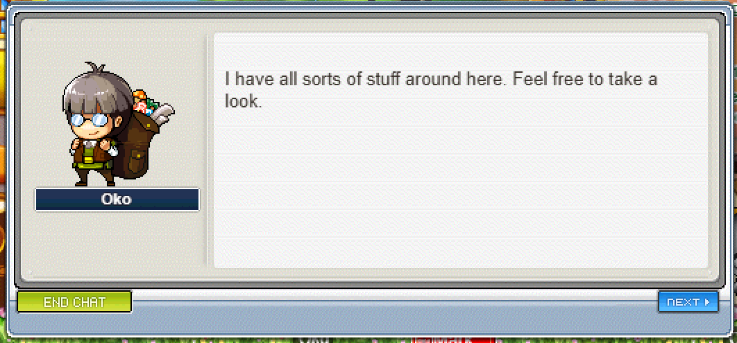
The row of buttons along the bottom of the NPC chat box was being positioned using measurements taken from a much later version of MapleStory, where that window is a different size and its buttons are smaller. Dropped onto our window art, every button landed 11 pixels too high, sitting up on the grey panel above the blue footer strip instead of inside it, straddling the seam. I confirmed that by measuring your own screenshots pixel by pixel against the original window graphics rather than taking anyone's word for it. The same borrowed numbers also pushed Yes and No 19 pixels apart instead of eight, and left that pair well to the left of where OK appears on a normal page. Your screenshots only showed End Chat and Next, so you would not have seen that part, but it was there.
A first fix went out earlier and corrected most of it. This change finishes the job: Accept and Decline are one pixel shorter than every other button and were still being placed as though they were the same height, so they sat a pixel high. They now share a bottom edge with everything else on the row. I also went back and re-measured the later version's artwork myself and found the note explaining where the old number came from was wrong, so I corrected that too.
Please re-test four things once this is live: an ordinary multi-page conversation showing End Chat, Back and Next; the first page of that same conversation showing End Chat and Next only; a yes-or-no question; and a quest offer with Accept and Decline. In each, all buttons should sit evenly inside the blue strip with their bottoms level.
One thing is still not settled. The exact left and right margins of the whole row cannot be proven from any original data we hold, so they are still the later version's numbers and the row may be two to four pixels left of authentic. A genuine screenshot of the original game's NPC chat box would settle it. I have deliberately not guessed at a nicer-looking number.
The row of buttons along the bottom of the NPC chat box was being positioned using measurements taken from a much later version of MapleStory, where that window is a different size and its buttons are smaller. Dropped onto our window art, every button landed 11 pixels too high, sitting up on the grey panel above the blue footer strip instead of inside it, straddling the seam. I confirmed that by measuring your own screenshots pixel by pixel against the original window graphics rather than taking anyone's word for it. The same borrowed numbers also pushed Yes and No 19 pixels apart instead of eight, and left that pair well to the left of where OK appears on a normal page. Your screenshots only showed End Chat and Next, so you would not have seen that part, but it was there.
A first fix went out earlier and corrected most of it. This change finishes the job: Accept and Decline are one pixel shorter than every other button and were still being placed as though they were the same height, so they sat a pixel high. They now share a bottom edge with everything else on the row. I also went back and re-measured the later version's artwork myself and found the note explaining where the old number came from was wrong, so I corrected that too.
Please re-test four things once this is live: an ordinary multi-page conversation showing End Chat, Back and Next; the first page of that same conversation showing End Chat and Next only; a yes-or-no question; and a quest offer with Accept and Decline. In each, all buttons should sit evenly inside the blue strip with their bottoms level.
One thing is still not settled. The exact left and right margins of the whole row cannot be proven from any original data we hold, so they are still the later version's numbers and the row may be two to four pixels left of authentic. A genuine screenshot of the original game's NPC chat box would settle it. I have deliberately not guessed at a nicer-looking number.